Overview
This tutorial covers reading a segmented measurement table. Producing this table from a plate zarr is a separate step (process_dataset, documented in the cell API reference) that must be run once per dataset.
Load
from cdk.analysis import cell as m

data = m.load(PARQUET_URL, PLATEMAP_PATH)
load reads local paths or https:// URLs, and accepts either format. The platemap is merged on Well. This returns a DataFrame you can work with in pandas.
Real timepoints
By default the time axis is Timepoint — an integer frame index. Pass minutes_per_timepoint to get real minutes. If you do this, every plot will use them automatically.
data = m.load(PARQUET_URL, PLATEMAP_PATH, minutes_per_timepoint=10)On a large dataset, sample= draws a random subset of objects, which makes iterating on a figure much faster.
Check the segmentation first
Before reading anything into the population statistics, look at what got segmented. plot_cell_grid draws real image crops with the mask outline on top:
m.plot_cell_grid(data, ZARR_URL, n=4)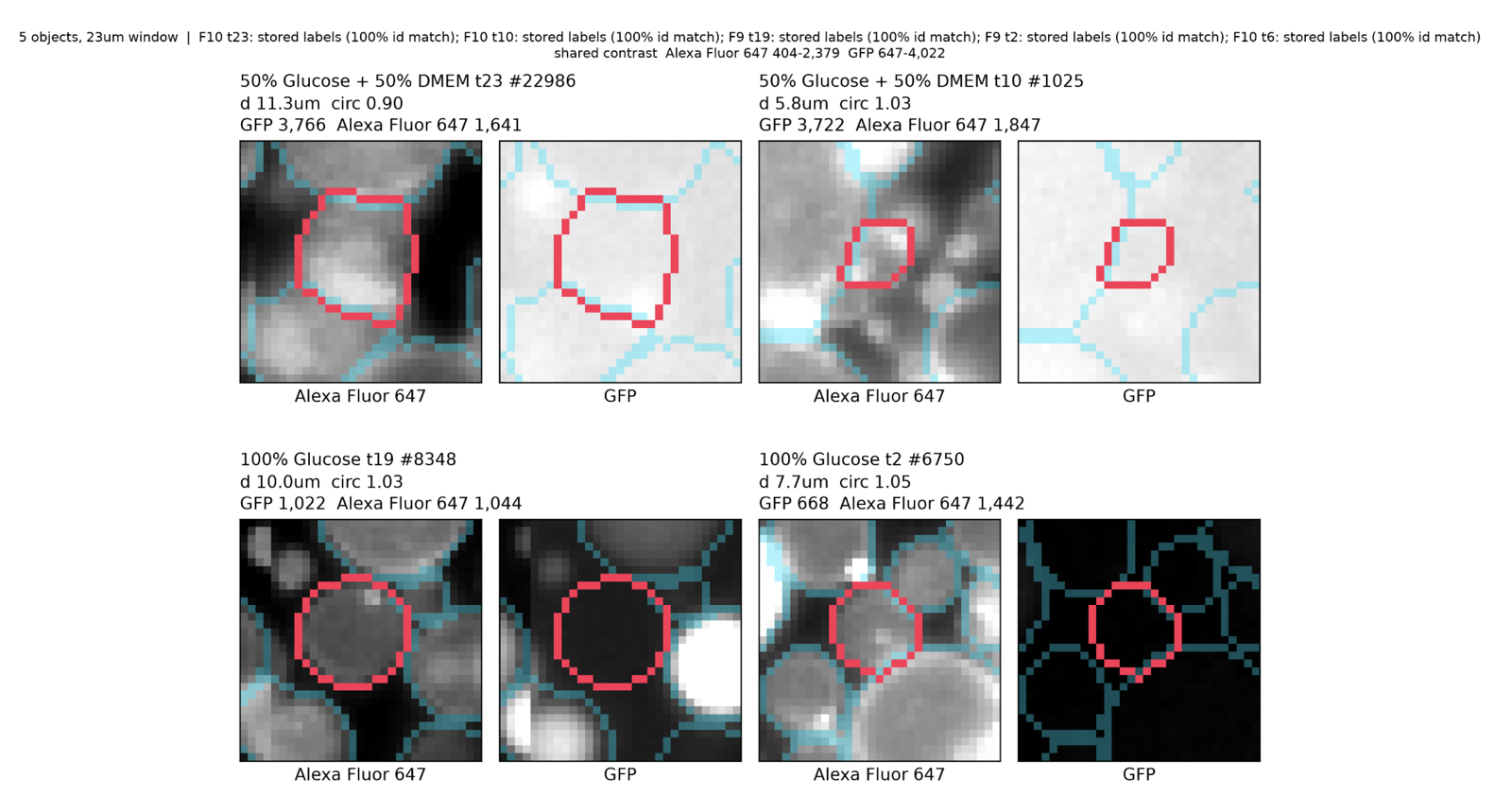
Segmented objects with mask outlines. Red is the selected object; teal are its neighbors that were also segmented. Each object is shown once per channel (here Alexa Fluor 647 and GFP) scaled to the same intensity range within a channel.
Objects are picked at random unless you narrow the frame you pass in. To inspect a specific well and timepoint, filter first:
example_subset = data[(data.Well == "M4") & (data.Timepoint == 0)]
m.plot_cell_grid(example_subset, ZARR_URL, n=5, channels=["Alexa Fluor 647"])
This one is slow
plot_cell_grid reads the image data rather than the measurement table, so it needs the zarr as well. Doing this for many cells could take quite some time.
How did the acquisition hold up?
plot_summary draws one panel per metric: the object count, then the median cell intensity in each channel over time.
_ = m.plot_summary(data, channels=["GFP", "Alexa Fluor 647"])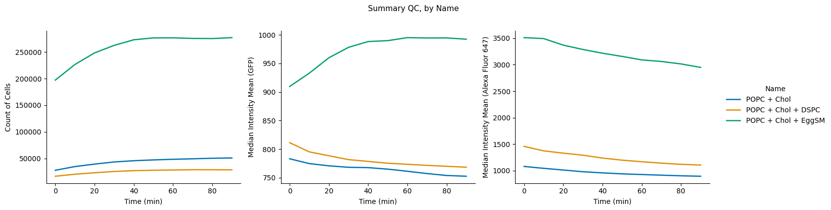
Object count and the per-channel median over time. Here GFP is the reporter and Alexa Fluor 647 the membrane dye, and the panels are grouped by the platemap’s Name column.
channels takes one channel name or a list of them, in the order the panels should read, and defaults to your reporter alone — name the segmentation channel too to check the acquisition itself. It stands in for the value argument the other plots take, since this is the one view drawing several measurements at once.
Absolute medians are hard to compare across conditions that start at different brightnesses, which is what makes the drift above easy to miss. Pass normalize=True to divide every intensity panel by its condition’s earliest timepoint, turning brightness into fold change; the object count is left raw.
_ = m.plot_summary(data, channels=["GFP", "Alexa Fluor 647"], normalize=True)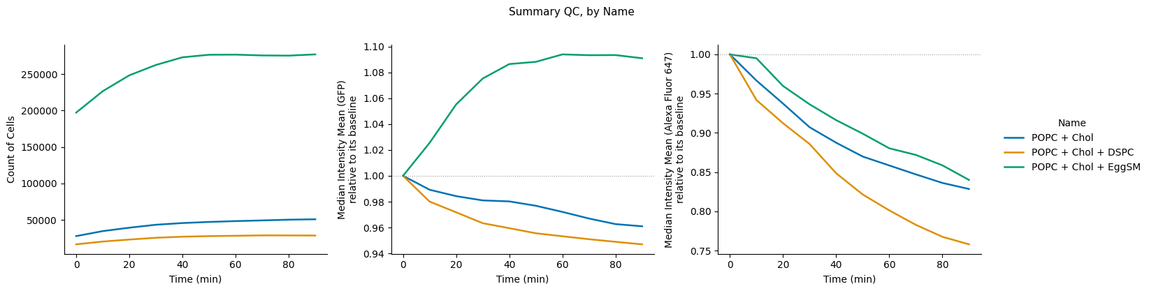
The same run as fold change off each condition’s first timepoint, with the dotted line at 1.0 as the baseline. The membrane channel loses 15–25% of its median signal over 90 minutes — that is bleaching — while the object count climbs over the first 40 minutes before flattening.
How did the population shift?
plot_quantile_ribbon is the main population view: the median as a solid line, with the inter-quartile range and P10–P90 as shaded bands.
m.plot_quantile_ribbon(data, hue="Osmolarity (mM)", facet="Name")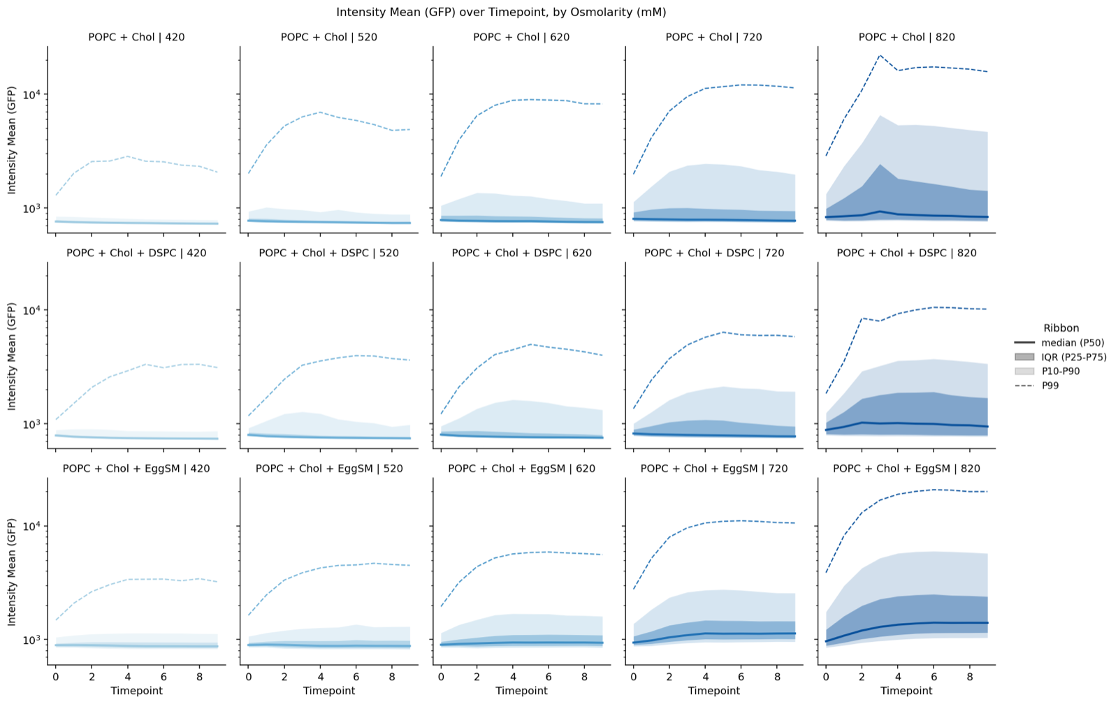
Population percentiles over time. The solid line is the median; bands are the percentile ranges named in the legend.
We split up into percentiles here because we noticed that there are oftentimes two separate populations: one that is actually turned on and others that practically do not turn on. In the figure above from real data, the 99th percentile carries the trend of cells that actually turned on, while the median barely shifts in intensity.
Turning on, or getting brighter?
Here we track how the changes in the population at the upper percentile (positive) compare to the lower percentile (negative).
m.plot_positive_fraction(data, facet="Name", hue="Osmolarity (mM)")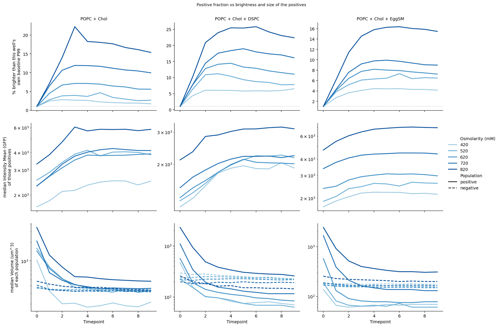
Top: what fraction of objects crossed their baseline gate. Middle: how bright those positives got. Bottom: the size of the positive and negative populations.
The three rows show the percentage of objects above their well’s baseline threshold (set at t=0), the median brightness of those positives, and the median size of each population. Adjust the threshold with gate_quantile=.
Does size correlate with expression?
_ = m.plot_size_expression(data, facet="Name")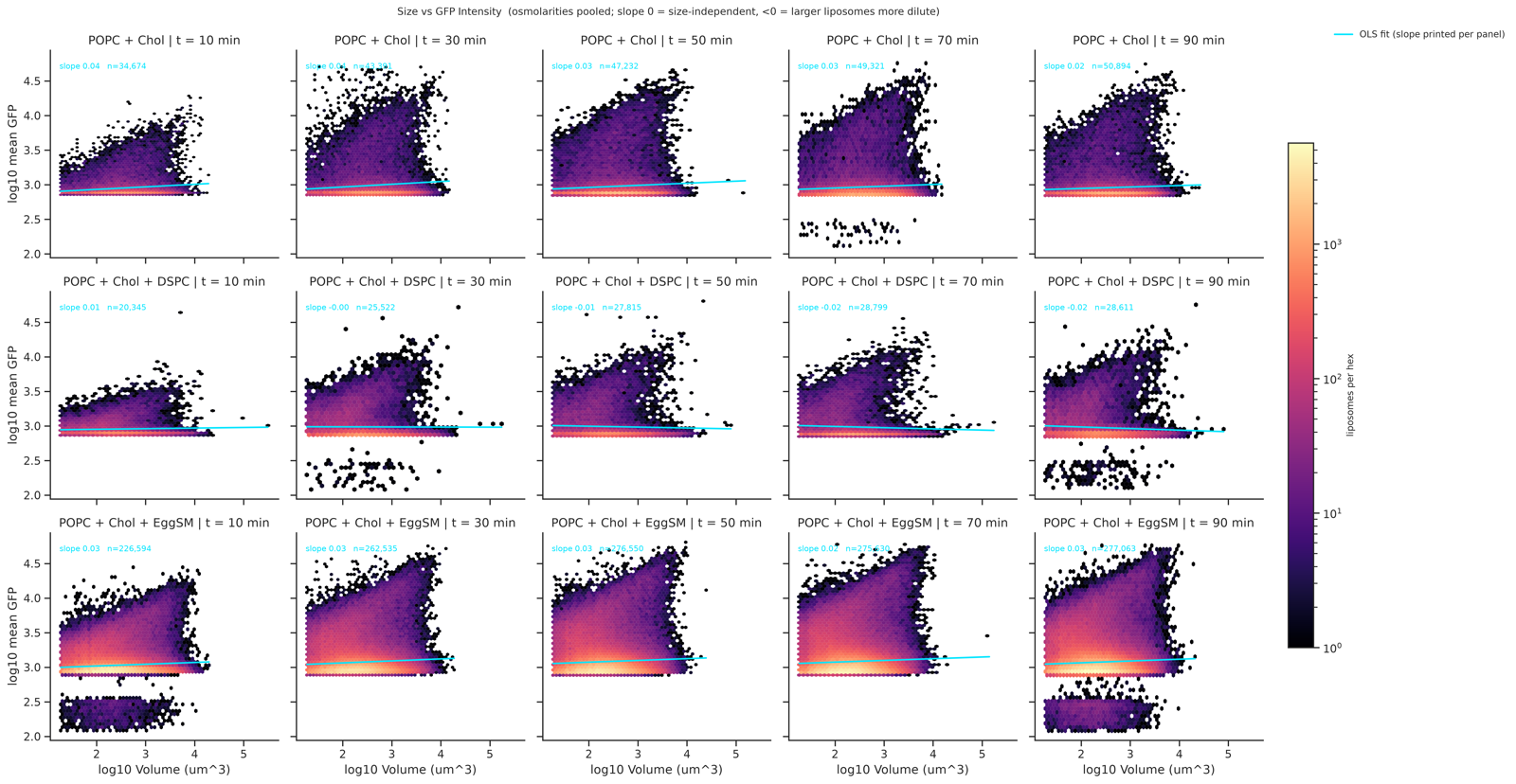
Per-object reporter intensity against volume, as a hexbin with a fit line per panel.
Two things to know about this figure
The low-intensity population is an artifact. The band of objects at very low GFP in the figure above comes from a dropped microscopy tile, and not from a real dim subpopulation. If you see a suspiciously clean low-intensity cluster, check your tiles before interpreting it. We saw dropped tiles on earlier versions of the microscopy hardware.
The fit line is fit to everything. It is not split by percentile, so a skewed population pulls it. Read it as an eyeline, not an estimate. Updates forthcoming.
Splitting figures by experimental factor
Every plotting function takes the same four arguments (hue, facet, time, and value), and all four default to None. This is where a platemap is very useful. plot_summary is the one exception on value: it draws several measurements at once, so it takes channels= instead.
m.plot_quantile_ribbon(data)                                       # groups by well
m.plot_quantile_ribbon(data, hue="Osmolarity (mM)", facet="Name")  # crosses two factors
The default values are:
| Argument | Default behavior |
|---|---|
hue | Name if a platemap was merged, otherwise Well |
time | Time (min) if available, otherwise Timepoint |
value | the first channel found among the Intensity Mean (…) columns — your reporter |
facet | None |
Numeric factors get a sequential color ramp automatically; categorical ones get distinct colors.
Other views
plot_ecdf gives the empirical CDF at a few timepoints, which shows the full distribution where the quantile views show summary percentiles. plot_size, plot_intensity, plot_fogplot, and plot_fogplot_compare are the earlier generation of overview plots. They still work, and will be deprecated once the quantile and gated views above cover their use cases.
Full signatures for all of them are in the cell API reference.